
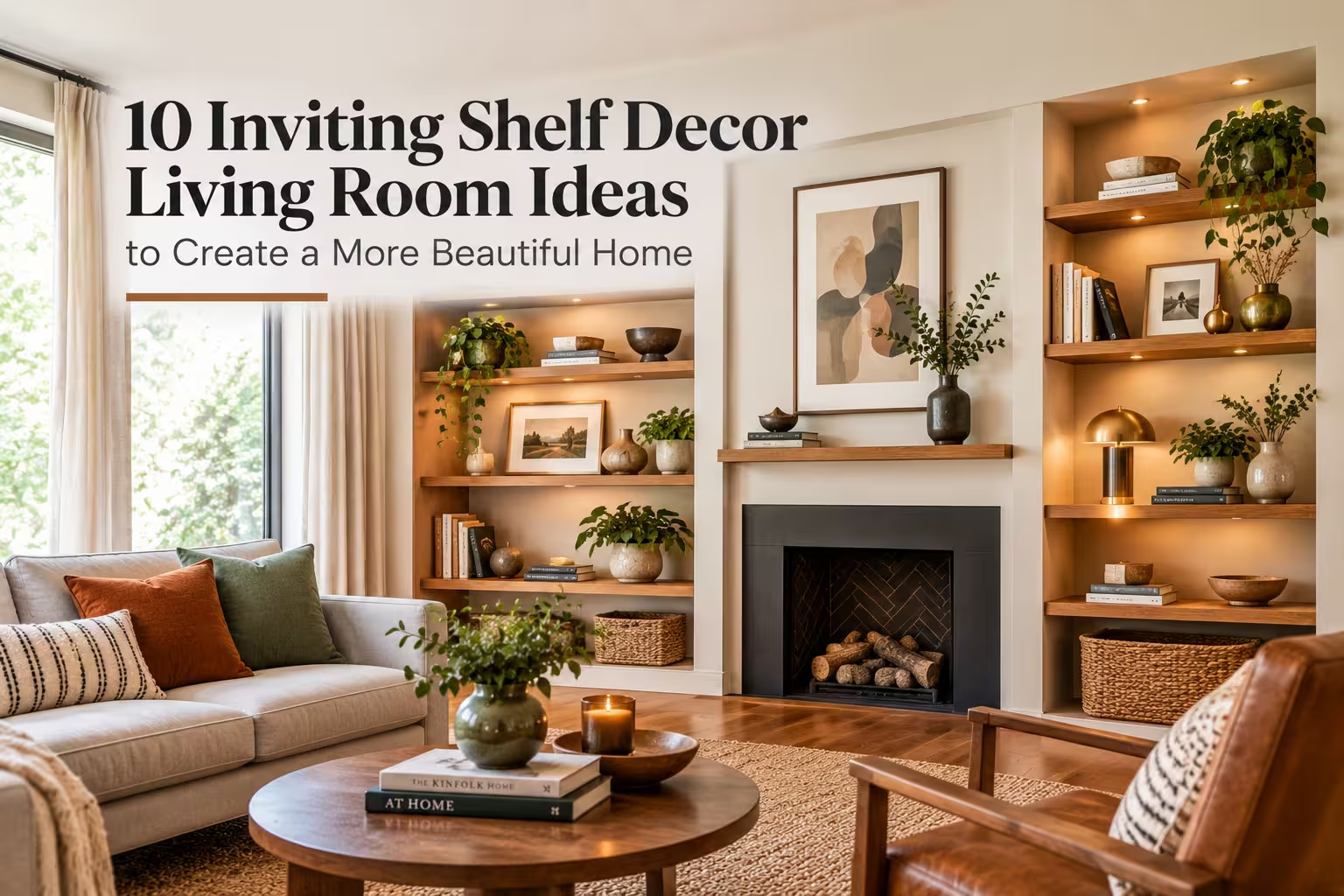
10 Inviting Shelf Decor Living Room Ideas to Create a More Beautiful Home
Styling your living room shelves can feel intimidating when you stare at empty wooden planks and wonder where to start. Too often, shelves end up cluttered with random knick-knacks or feel too sterile and cold. At Furnish Luxe, we have styled dozens of real living rooms, testing everything from budget-friendly big-box finds to custom built-ins. We have found that creating an inviting shelf display is less about buying expensive decor and more about layering textures, balancing negative space, and telling a personal story.
For more inspiration on creating a stylish and functional living room, explore 10 Sleek Mid Century Modern Living Room Ideas for a More Functional Home for smart furniture, storage, and layout ideas.
Ground Your Shelves with a Neutral, Textured Backdrop
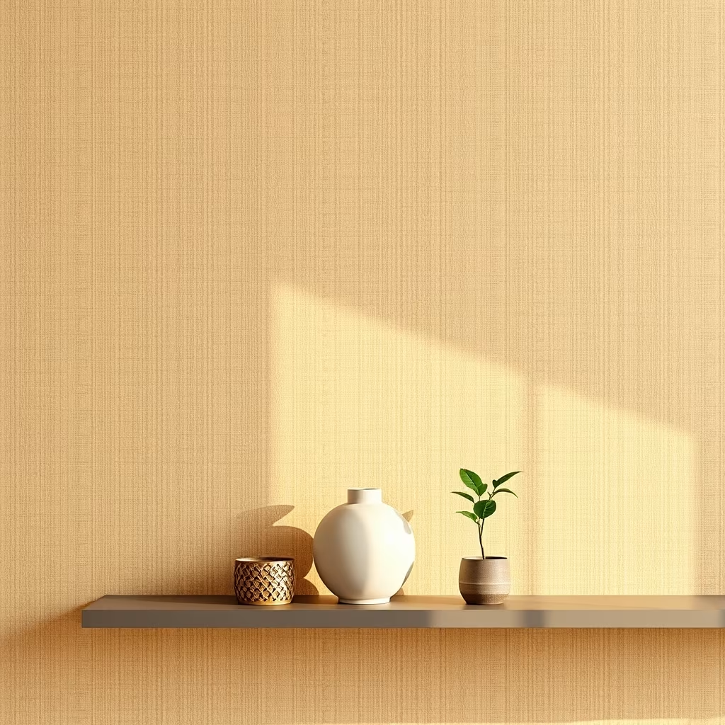
Before adding a single decorative object, look at the back of your shelving unit. If your shelves face a plain drywall backdrop, the entire display can look flat and uninspired. We love using grasscloth wallpaper, peel-and-stick linen texture, or even a soft coat of warm beige paint like Benjamin Moore’s Accessible Beige on the back panel. This trick instantly adds depth and warmth, making your display look custom-built rather than mass-produced. When we renovated a client’s narrow living room last month, adding a woven grasscloth backing made the whole room feel instantly cozier.
Pro Tip: Renters can use removable peel-and-stick contact paper in a faux-linen or wood-grain finish to get this high-end look without losing their security deposit.
Mix Vertical and Horizontal Book Stacking for Natural Rhythm
Books are the absolute workhorses of living room shelf decor, but lining them up like a public library kills visual interest. Instead, group your books in sets of three to five, placing some vertically with decorative bookends and others horizontally as pedestals for smaller objects. This creates an undulating, wave-like rhythm across your shelves that guides the eye naturally. When sourcing books for styling, take off the glossy paper dust jackets to reveal the neutral linen or cloth bindings underneath for a much more sophisticated aesthetic.
Pro Tip: If your book collection is full of bright, neon-colored spines that clash with your color scheme, simply turn the books around so the pages face outward for a minimalist, neutral texture.
Incorporate Organic Elements to Break Up Hard Lines
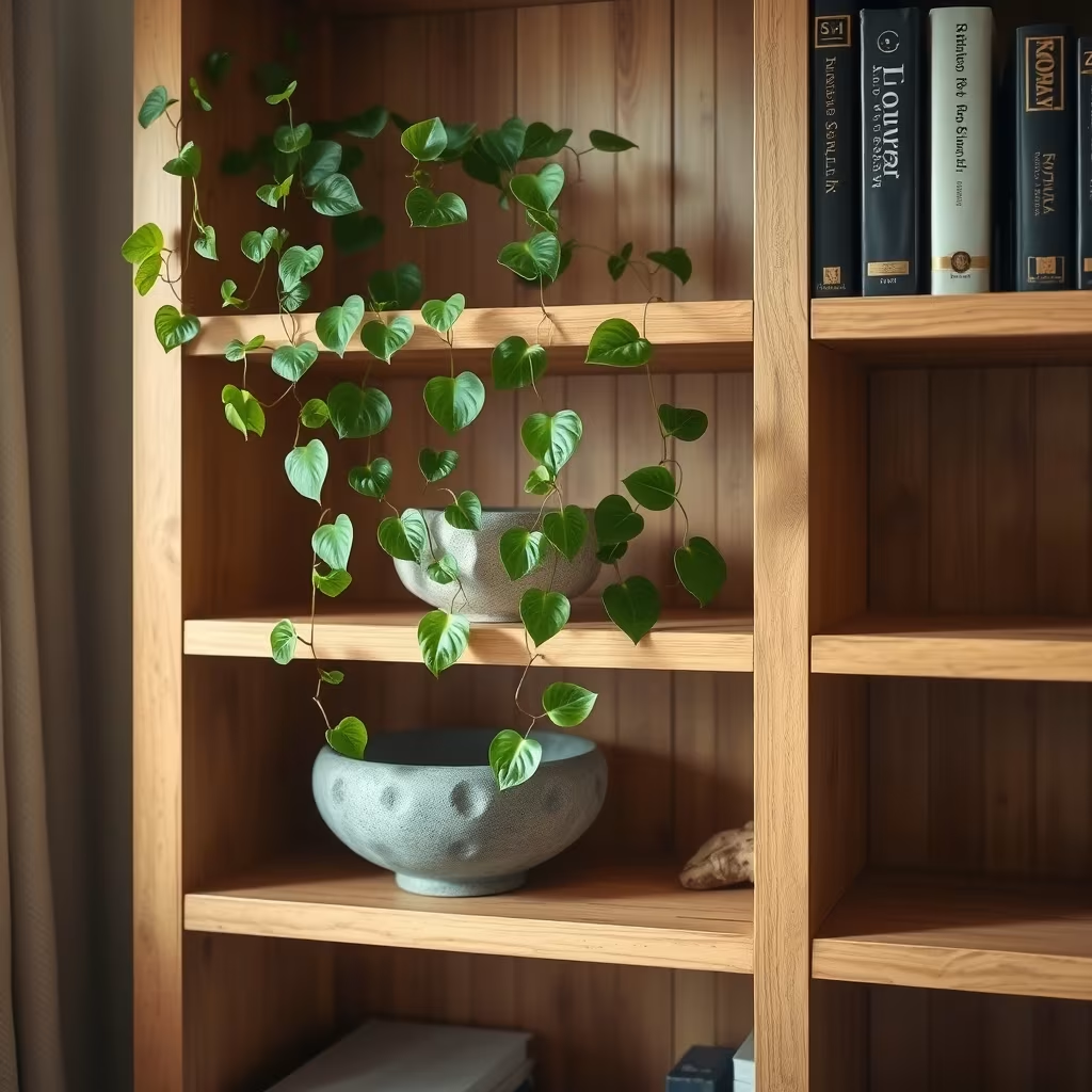
Shelving units are almost entirely made of straight vertical and horizontal lines, which can make a living room feel rigid and boxy. To counteract this, you need to introduce organic shapes and living elements. Trailing plants like a pothos or heartleaf philodendron soften the harsh corners of wooden or metal shelves instantly. We also love placing a heavy stone bowl, a rustic piece of driftwood, or a ceramic vase with irregular, handmade curves onto the lower shelves to anchor the heavier visual weight.
Pro Tip: If your living room lacks natural sunlight, opt for preserved moss balls, dried eucalyptus bundles, or realistic faux trailing plants that require zero maintenance.
Create Balance Using the Triangle Rule of Styling
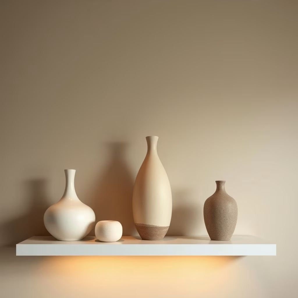
One of the most common mistakes we see in living room styling is placing objects of the exact same height in a straight row across a shelf. Professional stylists rely on the triangle rule to guide the viewer’s eye up, down, and across the entire shelving unit. Place your tallest item—like a large ceramic vase or framed piece of art—slightly off-center, then flank it with two medium-height objects to form an invisible triangle. This simple composition trick makes any collection look intentional and curated rather than accidental.
Pro Tip: Take a photo of your shelves using your smartphone camera; looking at your display through a 2D screen instantly reveals if your visual triangles feel lopsided or balanced.
Layer Flat Art Behind Dimensional Objects
Flat shelves often lack depth, making the room feel smaller than it actually is. You can fake architectural depth by leaning small framed art prints, vintage oil paintings, or heavy brass trays directly against the back wall of the shelf. Layer a smaller sculptural object or a bowl filled with matchboxes slightly in front of the artwork. In our own studio projects, we layer art pieces ranging from 4×6 inches to 8×10 inches to create overlapping planes that draw the eye deeper into the shelving unit.
Pro Tip: Skip hammering nails into the wall behind open shelves; simply use lightweight frames with sturdy backing so they lean safely without tipping forward.
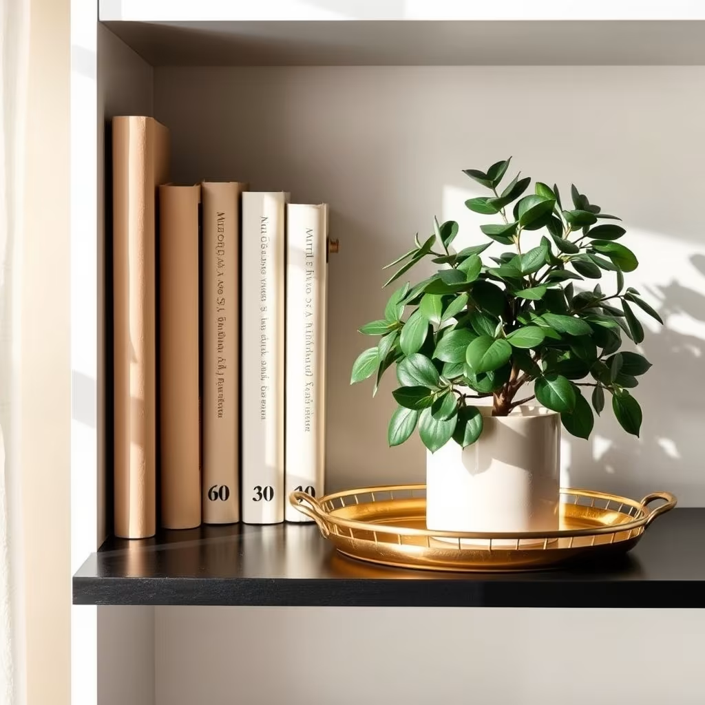
Curate a Restraint Color Palette Based on the 60-30-10 Rule
It is easy to turn living room shelves into a chaotic rainbow if you buy every cute decor piece you see at the store. To maintain a cohesive, high-end look, stick strictly to the classic interior design color rule: 60 percent dominant neutral (like white, beige, or warm wood), 30 percent secondary tone (such as olive green, terracotta, or charcoal), and 10 percent accent color (like brushed brass, matte black, or rust). When we designed a transitional family room last season, limiting the accent color strictly to antique brass instantly pulled the whole room together.
Pro Tip: If you love colorful vintage glassware or ceramics, group them together on a single shelf rather than scattering them everywhere to prevent visual clutter.
Embrace Negative Space as an Essential Design Element
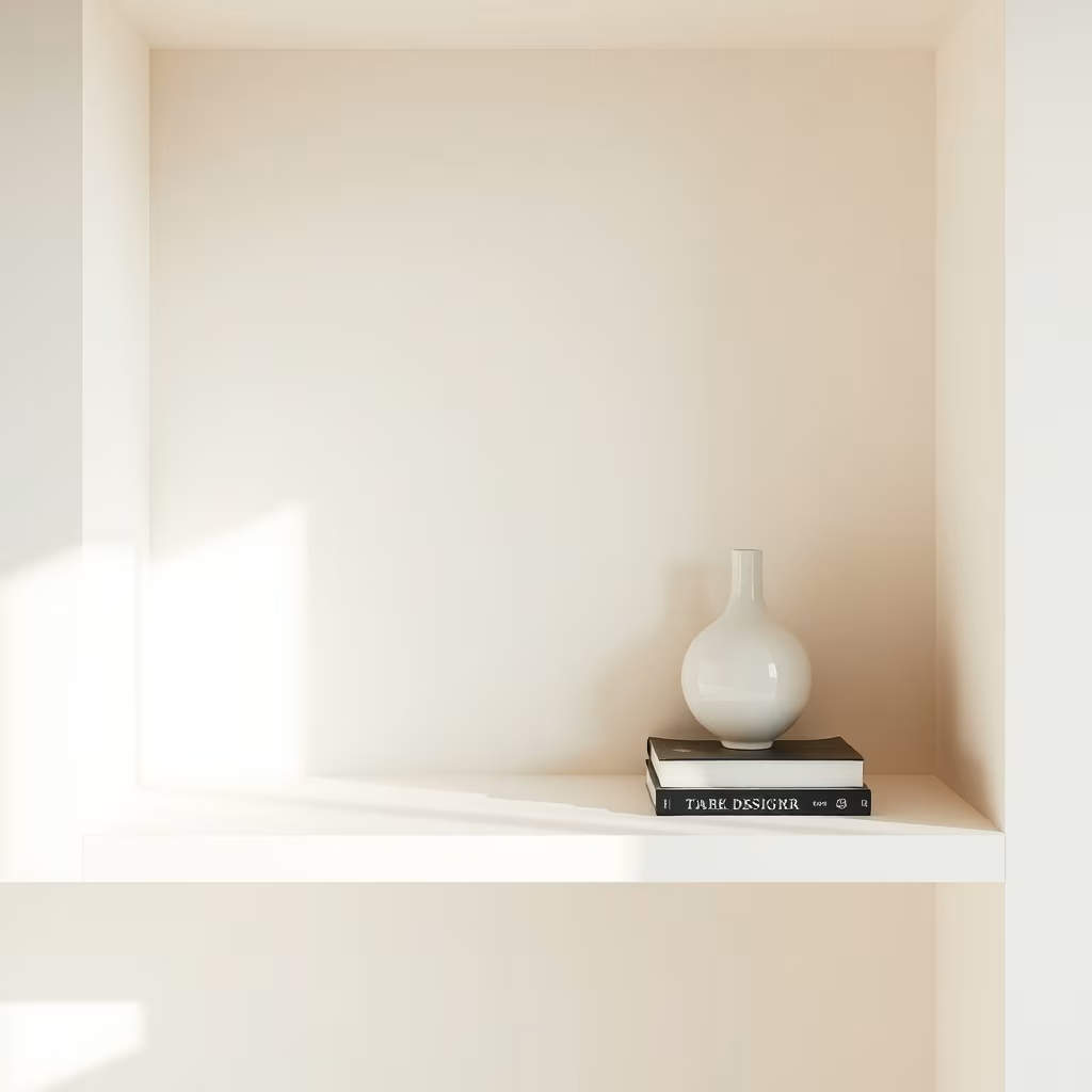
Not every single square inch of your shelving needs to be filled with stuff. In fact, leaving generous patches of empty space—known as negative space—is what separates professional interior styling from cluttered hoarding. Empty space lets the eye rest and allows your favorite statement pieces to truly stand out. If a shelf feels heavy, cluttered, or chaotic, take three items off immediately and see how much more breathable and luxurious the entire display feels.
Pro Tip: Dedicate at least 30 to 40 percent of your total shelf surface area to complete emptiness to achieve that airy, high-end designer look.
Introduce Warm, Targeted Accent Lighting
Living rooms rely heavily on ambient floor lamps and overhead fixtures, but open shelving often gets cast in deep shadows. Adding targeted lighting transforms your shelves into a stunning nighttime focal point. We frequently install battery-operated puck lights under the wooden shelves of built-ins, or place a sleek, cordless rechargeable table lamp directly onto a wide shelf surface. The warm glow bouncing off your ceramics and book bindings creates incredible ambiance during evening movie nights.
Pro Tip: Look for LED puck lights that include a remote control and warm color temperature settings around 2700K to avoid a harsh, clinical blue light.
Frequently Asked Questions
Q: How do I style living room shelves without spending a lot of money?
A: Shop your own home first by gathering books, framed family photos, and ceramic kitchenware. Thrift stores and flea markets are also goldmines for unique stoneware vases and brass candleholders that cost just a few dollars.
Q: What should I put on the bottom shelf of a living room unit?
A: The bottom shelf carries the most visual weight, so it is the best spot for large storage baskets, oversized art books stacked flat, or heavy ceramic bins that hide everyday clutter like remote controls and extra throw blankets.
Q: How often should I update my living room shelf decor?
A: There are no strict rules, but many homeowners like to do a light seasonal refresh—swapping heavy ceramics for lighter glass or greenery in the spring, and adding cozy brass and rich textures in the fall and winter.
Styling your living room shelves is one of the most rewarding weekend projects you can tackle to make your house feel like a polished, personalized home. By focusing on layered textures, smart color palettes, and intentional negative space, you can turn bare boards into a stunning focal point. Start with one single shelf today, apply the tips above, and watch how quickly your living space transforms.
Leave a Reply